Sorry, We Are Not In Right Now

Hi,

Thanks for checking out our blog, we really appreciate it.

However, our blog has moved to http://travel2dot0.wordpress.com/

Sorry that you have to visit another site to find us, but it is worth it...we have all of our 'classic' posts and comments on the new blog, plus a ton of new thoughts and ideas.

Why are we moving? Basically, Blogger failed us and never responded to our emails and requests. A clear example of poor customer service...too bad, we liked Blogger.

Come over and see us on the new blog.

Regards,
Troy and Mo
Showing posts with label Case Study. Show all posts

Tuesday, July 29, 2008

Brands on Flickr


You don’t see nearly as many brands on Flickr as you do on YouTube or Facebook. But they do exist, and after a few conversations recently about what the opportunities for brands were on Flickr I thought I’d have a look. Having trawled through pages of Google and Flickr searches, I’ve grouped the results into three categories:

- Brand communities and extensions
- Branded resources
- Branded contests

And at the end of the review of what’s out there already, I’ve distilled a few learnings, a few things to watch out for, and a conclusion around the opportunities for brands on Flickr. >>Full Story

Thoughts// A great post from Geoff Northcott of AKQA London on how brands are using Flickr to connect, communicate and join communities. Unlike MySpace, YouTube and Facebook, which seem to be littered with brands, Geoff highlights why the few brands that are utilizing Flickr to begin a social conversation are benefiting from the lack of competitive social marketing.

The post provides case studies and examples from a variety of companies using Flickr as well as tips on how to begin you social presence on the photo-sharing site. And, if you listened to us last week, you should have your Flickr social URL in hand.

While Flickr might not the right fit for certain brands or industries, fields such as travel could benefit from the already built-in passion of travelers taking photos. A stretch, I know. Beyond building a community and increasing you social reputation among Flickr users (like AOT is doing with our Arizona Passages campaign), gaining a fan-base on Flickr can help greatly with UGC photo contests, sourcing new (and cheap, if not free!) images (just be sure to ask!) and adding content to your site via the Flickr API.

In fact, I even know of a few organizations who are currently using Flickr to house their entire photo library or catalog. Not a huge company mind you, but at $25 a year for unlimited file storage, it might be worth a look.

Even if you don't want to share those photos socially just yet.

Thursday, July 24, 2008

Don't Want To Write A Blog? Have Someone Else Do It For You


With the Olympic Games just a month off, some brands are looking to extend their sponsorships with social media programs. Lenovo has created 100 athletes' blogs in an attempt to align itself with some less mainstream sports, such as field hockey and modern pentathlon. It gave the athletes laptops and video cameras to chronicle their preparation for the games.

"We wanted to do something that shows our tech prowess, not something that uses the Web as billboard," said David Churbuck, vp of global Web marketing at Lenovo. >>Full Story

Thoughts// A great story from Adweek on computer maker Lenovo's digital strategy for the upcoming Olympic Games. Rather than start an 'official Lenovo Olympic blog', they reversed the thinking and have hundreds of athletes blogging for them. Give them the tools...blog, video camera, hosting, etc...and let them provide the content.

The reason I love this story is the thinking behind it and how it could apply to travel.

If you are a DMO or destination, you will more than likely (if you are popular) already have consumers / bloggers in your area who are blogging about you, restaurants, attractions (roller coaster 'nuts' love to blog), etc, etc. Rather than compete with them, why not create a certification program, similar to what Lenovo has done with these athlete blogs, and issue an official 'DMO seal of approval' for each blog.

Here is a secret, bloggers love to be acknowledged! Give them an 'official blogger for DMO XYZ logo' (see the Lenovo version at the bottom-left of this page), a little praise and recognition and aggregate these blogs into one large DMO blog site.

Lenovo has asked the participating athletes to show a "Lenovo 2008 Olympics Blogger" badge on their sites. Most have done so, said Churbuck. It isn't asking for any mention of Lenovo products, he added.

"I don't want to be in the position of telling them what to write," he said. "It's their blog, they can do what they want."


Just like that you have updated content, in a blog without a major time and resource commitment from your organization.

Of course, keep in mind that these bloggers are representing your brand, so ensuring professional, relevant and proper content is critical. But, an interview process (I would actually have them come to your office for the interview), a basic agreement and some solid research on the person should result in finding the most qualified bloggers for your site.

Perhaps you can start that blog after all.

Tuesday, March 18, 2008

The Loneliness of the Long Distance Runner

Last April, Reebok kicked off its "Run easy" campaign, using print, out-of-home, TV and online to promote the shoemaker as the everyman alternative to the catering of hard-core athletes by rivals like Nike. Three months later, the traditional elements of the campaign wrapped up -- except Goruneasy.com, a community site Reebok agency Carat set up for the push. There, runners kept coming back to share routes and post messages. Nine months later, they're still coming -- even from places like Australia, where Reebok never ran ads. >>Full Story

Thoughts// Running ain't so lonely anymore...especially with a social network such as Goruneasy.com and a community of users telling you where to run anywhere in the world. This interesting story from AdWeek really proves the point that if you build something truly compelling and useful for consumers, they will keep coming back to it long after the marketing campaign and buzz is over.

The article we've linked to is really about how "promotional efforts can take on a longer shelf life" in this fractured digital environment; after checking out the site, I had no doubt about why this was so popular. While the site is a bit rough around the edges (mysterious time outs, multiple prompts to log in etc.), I was really impressed and drawn in by the rich user experience of that lends itself to a very intuitive and engaging community site experience. The site allows a user to:

  1. Find a running trail/route by zip/city
  2. See who's recommending the run (Yes, this needs more relevant info content - marathon runner, casual runner etc.)
  3. Integration with third party API's such as iTunes, Flickr (and yes, Google Maps) that allows users to share their photos and music

If you're ever in Portland, come run with me in the Montavilla Neighborhood!

Tuesday, March 4, 2008

Case Study: VisitCalifornia.com Launches...Again?


Okay, so maybe not a Case Study in the traditional sense, but let's take a moment to look at the brief history of VisitCalifornia.com.

Thoughts// On Monday, Melissa from our Research team at AOT forwarded me this press release about California launching a new website (visitcalifornia.com)...and my first thought was, 'didn't they just launch that site?' Turns out they did, about a year ago in fact, and if you had been visiting the site every so often you might have noticed some small changes which could shed some light on this most recent update.

So, let's take a look at the 'old' site:


A pretty nice looking site and, if I remember right, there was a good amount of conversation about the layout and design of this site. This is, or was, the whole homepage. The design kept the page 'above the fold' and very compact. Visually it is a very easy to read design. However, having being involved with another compact design choice, I did wonder how the consumers and constituents would react to such a minimal homepage.

When creating a minimal homepage, there are two big challenges (out of many) that come up...navigation and the desire to have everything on the homepage.

With such few choices on where to click, users must understand your navigation structure immediately in order to locate the content they are looking for. In VisitCalifornia.com's case, the navigation at the top only provided one or two words of copy and no drop-down menus. For visitors who may not be familiar with the state, that could be a lot to ask.

Another big challenge is what content goes on the homepage. Ah, the homepage. Everyone in your organization wants everything there, all the time...but, make sure it is appealing and user-friendly. Okay, so a bit of an exaggeration, but not by much. With such a small homepage footprint, I would assume that keeping certain content off the homepage required a strong internal policy or earplugs for the webmaster.

The 'old' site, version 1.1:


Here we have version 1.1, as I will refer to it. Notice the white bar in the middle of the page...the one with the surfer image...that is a new element. Too small to read in this execution, but the text basically says there is a lot to do in California and has links to destinations, activities, events, etc. In theory, the only reason to add more links to a certain area of site, especially a broad one such as this, is because consumers are having a hard time finding it. Again, just an assumption on my part, but I feel pretty confident this was one of the reasons.

And now the new site, version 2.0:


As you can see the new site is visually similar. Colors, photos, structure, the white boxes all remain, however the size of the page, content on the homepage and the navigation have all been updated. I liked the boxy-feel on version 1.0/1.1, however with the expanded content on the homepage, the boxes begin to feel a bit cluttered, with too much information for this simple, effective design.

In version 1.1 a user only had to scan 5 boxes, which is just about right for the average person...easy to read and understand the content that is presented in those 5 areas. In version 2.0, we have 9 boxes to read, which requires more than a quick glance. Plus, the boxes are not as clearly defined. Interesting what a large difference those additional 4 areas create.

Finally, the navigation certainly provides more information, which should be a plus.

As with any of our case studies, this is certainly just one point of view. I am sure the CT&TC did a large amount of research when making these changes to ensure that the new site is beneficial for the consumer. And FYI, I am trying to contact my counterpart in Sacramento for some more insight as well as a look at the process that went into these design changes.

That being said, this is a fascinating example of website design and a good case study for anyone evaluating the effectiveness of their own website.

Tuesday, February 5, 2008

Design & Branding For A Presidental Campaign

STYLES make fights — or so goes the boxing cliché. In 2008, they make presidential campaigns, too. According to design experts, the candidates have left a clear blueprint of their personal style — perhaps even a window into their souls — through the Web sites they have created to raise money, recruit volunteers and generally meet-and-greet online. >>Full Story

Author's Note: Not travel related but relevant.

Thoughts// It's Super Tuesday! With almost half the country voting today in both the Democratic and Republican primaries, this NY Times article is a relevant study in how candidates (brands) extend their personalities (values) in the digital medium. Specifically, this article focuses on Barak Obama and Hillary Clinton and analyzes how their websites and other digital channels reflect their personalities.

BarackObama.com— much like the candidate—reflects a modern, elegant look that uses a soft blue palette with a lot of white space and harmonious integration between the website and other platforms such as social networking sites. Of course it goes without saying that the effective use of mobile and social networking have no doubt galvanized the outreach to young people and this effort appears to have positively impacted voter turnout.

HillaryClinton.com on the other hand takes a bit more of a traditional design approach with the tried and true red, white and blue palette, rigid boxy navigation and "cookie cutter" icons. The site also uses mobile and social networking for voter outreach.

Overall, in reviewing the sites of all five leading candidates (Clinton, Obama, McCain, Romney, Huckabee), it's remarkable that:

  1. All candidates view their digital offering as a conversation - they all offer offer a mechanism for voters to interact with the sites (feedback, voting, blogging, communities) and harness the power of these site tools into action (fundraisers, events etc.).

  2. Blogs are omnipresent; from campaign updates to policy news, candidates and their fans are "blogging mad". The most noteworthy blogger however appears to be the effervescent Meghan McCain who writes what appears to be authentic stories from the road.

  3. All of the candidates are tapping the power of social media - from Flickr to YouTube and Eventful to Facebook, voters have multiple ways to interact, follow and "evangelize" their favorite candidate.


Happy Super Tuesday. Now go vote!

Update: Troy and I were chatting about this subject via e-mail this morning and he mentioned hearing a great story on NPR last night on the same topic; you can listen to the story here.

Monday, February 4, 2008

Quick Case Study: Google Trends

Last week I discussed using Google Trends to monitor and gain insight into your web presence, and with Super Bowl XLII this past Sunday in beautiful Glendale, Arizona (Go Grand Canyon State!), I thought this would be a good case study for the system.

As a refresher, Google Trends shows a graphical representation of search volume for (up to) 5 keywords over a period of time.

The graph above shows the search volume for the keywords 'superbowl,' 'glendale,' 'arizona,' ' phoenix' and 'scottsdale' during the month on January. In looking at this graph, I was surprised by the late build-up of the word 'superbowl,' which only overtook the works 'arizona' and 'phoenix' around the 16th or 17th of January. And notice the pattern for 'arizona,' it really does not fluctuate to greatly during the month of January...any assumptions that the Super Bowl being in Arizona would result in a direct spike in online traffic appears to be unfounded (at least in terms of Google Search).

Unfortunately, Google Trends does not allow us to look at the data a granular level, such as a keyword like 'arizona travel.'

For another look at the data, let's drill down to the states of Massachusetts:
And New York:
Another interesting note, notice that the keyword 'arizona' (orange line) is pretty consistent in New York, but certainly takes a larger jump in Massachusetts. A possible explanation is that we do limited advertising in Boston / Massachusetts, but a bit more in New York...so the volume of search was already high in New York.

Some of you are probably asleep at this point, but for the rest of you, try out a couple of searches using Google Trends. It does provide a good look at search traffic...especially the volume of that traffic during a major event.

Thursday, January 24, 2008

Quick Case Study: When Life Hands You Lemons...

Like many of you, Travel Oregon publishes a monthly e-newsletter to keep Oregon "top-of-mind" and build a long term relationship with consumers. We were especially proud of our January issue which was chock full of fabulous getaway/fitness ideas and special events. The edition with the subject line of "Happy New Year from Oregon" was scheduled to go out the week of January 7th.

After the usual "pre-flight" preparations with the editorial team on spelling, punctuation, voice and all that good stuff the edition was ready to go. So imagine my horror when we noticed that the first batch of 40,000 e-newsletters went out the subject line "Step into Spring!"

Upon investigating, we discovered that a "snafu" in the send process resulted in the first batch of consumers getting our April 2007 edition! Yes, 40,000 people received a "spring" message in January when the snow was pilling high on our mountains! If there was ever a moment where I wished I was in one of those "wanna get away" Southwest commercials, this was most definitely it.

Thoughts// One of the core values of marketing that Troy and I have repeatedly talked/written about is "honesty" and "transparency". In an age when brands can be elevated or torn down in an instant by the community, being authentic and true about yourself and your products is the only guaranteed recipe for long term success. So we embraced our mistake and made lemonade; we issued an immediate apology while poking fun at our woeful selves with an irreverent message that read:

"Happy New Year! It's 2008, right? Yeah, we thought so…

While we were getting ready to send you the very latest from Oregon this January – 2008 – it seems "spring fever" hit us early and we mistakenly sent you April's edition – 2007 – instead. Call us sentimental. We love April. Really. No slight to January, of course. We like January in Oregon too. And November. And, well, July is GREAT. But April… oh that April… we're very fond of April.

But, we think you should really get to know Oregon in January… cool, snowy, fluffy, festive, … January rocks in Oregon! So watch your email box for our exciting adventures to be had in January… January 2008. Yes, 2008. With snow levels above normal and Oregon's mountains covered with snowy adventure, it's definitely not spring in Oregon. Is it? No. We're pretty sure it's not.

Anyway, sorry for the mix up… you can come back in April if you like. Did we mention we like April? Have a wonderful 2008… get out and enjoy the snow!

The Editors"


The price of transparency? LOVE (or sweet lemonade). We actually got more positive feedback on the apology than response to the original "April" email or the typical monthly e-newsletter! Here is a sampling....

  • That was, by far, the most entertaining e-mail slip-up apology ever. Well, maybe not as bad as the time I tried to weasel out of insulting my father-in-law by way of the "reply" button instead of "forward", but... bravo. :) - Cara S.
  • Too cute. Loved the email! - Bonnie & Dan H.
  • Very cute! I LOVE everything you do no matter what the month or year. Even the mistakes. Did you know you’re even more lovable when you can admit your mistakes and laugh at them? I love a great sense of humor! You made me smile. I’ll be with you every month and year in Oregon. - Lori P-H.
  • I love an organization where people have a sense of humor and don't take themselves too seriously. We are all human! And don't worry, I won't cancel my (free) email subscription! :)- aerosmithchik

To be fair, we did have one really negative comment and had a few folks who unsubscribed. But the overall responses was so positive and supportive that we were absolutely blown away.

Lessons learned? 1) Embrace mistakes faster; 2) Keep sending wrong e-mail editions to keep 'em guessing (just kidding!)

Happy Friday!

Wednesday, January 16, 2008

Quick Case Study: Email Appearance

For those of you sending emails...which I would imagine is most of you...make sure you take the time to test the appearance of your email messages in a variety of browsers and ISPs prior to sending the message.

For instance, take a look at the example I received today from South Carolina.

Here is what the email looked like when I viewed it in Outlook (via the Reading Pane option):


Not that appealing.

As you can see, Microsoft Outlook (which we all know is just trying to protect me from people like that guy in Africa with the $5 million dollars) has decided to block all of the images within the email. Which, in this case (due to the HTML coding) makes the email nearly impossible to decipher.

At this point, I think you can safely assume that most users reach for the delete key.

Here is how the email is suppose to look:


Ah, that is better. And a pretty good looking email, too.

Now, I should not pick on South Carolina too much for this mistake, because I know (like many of you as well) I am guilty of the same error.

However, with the amount of advertising clutter the average traveler wades through each day, you need to ensure that they can quickly recognize your message.

Friday, December 28, 2007

It's December 28th, the Perfect Time For A Pre-Christmas Sale!


As I was checking my email last week, I noticed a peculiar banner ad in my peripheral vision. Which is pretty common, but from some reason this banner caught my eye...but not in a good way.

Thoughts// So, there I was, last Friday, December 28th, checking my email when I noticed this Bloomingdales banner ad. And I thought myself, 'what day is it?' Now at this point last week all of the days were running together and I was not sure what day it was. According to the banner it was December 24th, the day before Christmas.

But I seem to remember opening gifts already.

But the banner says that Bloomingdales is having a 'Right Before Christmas' sale and I can save an additional 40% off.

Wait, this can't be right. The banner must be wrong!

While this story is not exactly related to travel, it is a good lesson for anyone who runs banner ads or CPC ads or any date-sensitive ads. My immediate thought when I saw this ad, 4 days after Christmas Eve, was 'what a screw up by Bloomingdales.' However, the interactive marketer in me knows that (more than likely) Bloomingdales did not buy or flight that ad personally, there ad agency or network did. But my negative reaction and bad impression gets attributed to the company, not the faceless ad agency that is running the campaign.

We all know it is difficult to stay abreast of all advertising campaigns and executions, especially online, but if you ad is running a highly noticeable sale tied to a widely known holiday, you might want to double check the end date of the campaign.

Otherwise I (and most of your consumers) will get a bad impression of you.

Wednesday, December 19, 2007

VisitFlorida.com Redux. Continuing the Conversation With Florida's Interactive Team.

Hello Sunshine! This is the second installation of a two part conversation with CA Clark, VP of Electronic Publishing at Miles Media, the interactive agency for VisitFlorida. Yesterday, CA responded to our initial questions about the inspiration for the design of the new VisitFlorida site and it's novel use of tag clouds as a primary navigational element (yesterday's blog is available here). Today, we're going to primarily focus on content - who manages it, how portable is it and how Florida handles the vast sea of user generated content, comments and photos.

How are your partners able to edit/add content to the site? Is the process automated or do they have to be facilitated via staff?

In a variety of ways, but the main way is via a partner extranet application that we also re-built from scratch as part of the new site. That application embraces a lot of the same technological approaches in terms of focusing on the user interface and employing AJAX and JavaScript to do as much as we can without having to reload the page.

Through the data engine, partners can add, edit and delete their property information, amenities, photos, videos, 360s, events deals and respond to comments made about their property.

I've been working exclusively in the web publishing business for 12 years and I can definitively say that this is the most complex, most complete and largest project I've ever been involved in. We had an active team of about 12 people working on various aspects of this project for over 14 months. It's been a long road, and we're really happy with the result, we hope Florida visitors will be too.

What considerations were made so that your data is portable (i.e. can be used to generate widget/gadgets on social sites)?

The whole architecture of the site is really built to be modular. Essentially all the data we've got - photos, videos, stories, trips, etc are all stored in their own silos. So if we wanted to say take the photo strip piece and turn that into a widget for use on another site, it's really just a matter of dumping the structure we already have into XML and distributing the widget. It's something we'll be looking at after launch.

The Florida site is awash with opportunities for users to contrinute their opinions and photos to the site. With so much UGC and commenting available, how are you handling the monitoring and editing of those comments? How are you handling negative comments?

We're trying to make the site both as useful and as transparent as possible. To that end, user comments are posted immediately. There are several steps to get to that point, including a illegal words filter and verification to make sure you're a human; but we felt that if users had to wait for a day to see their comments, we'd kill the whole concept of sharing. Visual content like photos and videos are a different story, before those are publicly available they need to be reviewed by a human since there's no AI I'm aware of that could accurately filter out inappropriate content. As for negative comments, they'll stay as long as they're relevant to tourism and verifiable.

Why were certain elements...text, font, color, size...selected for the site?

Obviously there are a lot of different factors that go into design, not the least of which is the branding campaign and approach of the client.

In this case, VISIT FLORIDA's "sunshine" campaign was the basis for the design and implemented in a way that we hoped wouldn't get in the way of the use of the site. Beyond that, we tried to use web-safe fonts wherever we could and minimize the number of images that had to be created and to be consistent throughout with the visual cues we provided. Most of the active stuff has the same little blue buttons, the links are all consistently formatted, titles are similarly formatted, etc.

Tell us what you think! Does the new Florida site inspire you to hit the beach? Take our online poll and give us your feedback!

Tuesday, December 18, 2007

Case Study: A Conversation With the VisitFlorida.com Interactive Team


I've always been impressed with the interactive programs at Visit Florida and have developed a tremendous amount of respect for CA Clark (Vice President of Electronic Publishing) and the rest of the team at MilesMedia who work on the account. In fact, the Florida site was one of the top five inspirations for me when I started working on our programs in Oregon three years ago.

When Troy and I found out that VisitFlorida.com relaunched their site this winter, we just couldn't help but chat up CA Clark for his insight into the new site. The following is part one of a two part e-mail conversation between CA and the Interactive Trend Report.

How was the design of the site used to create a positive impression of Florida?

First of all, this is really a very different approach to design than I think you would typically see on a destination site. Instead of the big header visuals, we've got a very large content area that incorporates tons of thumbnails, maps and tools. So from the start, we're not approaching this as a traditional design project. Instead we tried to look at it more like an application, which is the direction we think the web is really going. To answer your question more directly - I think we're creating a positive impression of Florida through the presentation of the content on the site - photos, videos, stories, trips, listings - rather than through the site itself. We're trying to get out of our own way and let the content speak for itself.

What websites, either travel-related or not, influenced the new site?

Lots really, the home page and tag display pages owe some to Yahoo!'s niche sites like food.yahoo.com; the trip planner borrows some from backpackit.com and basecamphq.com; Kayak and Pricegrabber were both models for some of the listing display stuff that we did. There are lots more, I'm sure I'm missing some important ones. We were definitely trying to make something that was competitive not just on a destination basis, but on a broader web industry basis.

How are you, or will you, integrate the print travel guide into the site and vice versa?

The VISITFLORIDA.com site is meant to be the primary fulfillment mechanism, so there purposely aren't a lot of references from the site back out to the guide. Having said that, the new site creates a lot of new possibilities for intertwining content between the two such as integrating the experts into the guide with references out to the site or including user-supplied photos or trips in the print products.

What do you think the reaction will be to the tag cloud navigation structure?

We did quite a bit of usability during the build, and a lot of that was focused on the navigation. What was interesting is that while the test users didn't necessarily understand what a tag was, it didn't prevent them from using the site as intended. So we changed some of our labels, but basically we found that people didn't have to understand the structure for it to be useful. So far our beta testers don't seem to have had problems either, so we're feeling pretty positive about the public reaction when we do the full release.

Tune in tomorrow for a continuation of this conversation. In the meantime, do tell us what you think about the new Florida site via our online poll (click the link to vote if reading via email or RSS). How do you feel about the use of "tag clouds" as a primary navigational element? Does the creative inspire you to hit the beach?

Wednesday, November 28, 2007

23 Actionable Lessons from Eye-Tracking Studies

Eye-tracking studies are hot in the web design world, but it can be hard to figure out how to translate the results of these studies into real design implementations. These are a few tips from eye-tracking studies that you can use to improve the design of your webpage. >>Full Story

Thoughts// A great post from the blog virtualhosting.com containing several tips and observations from a variety of eye-tracking studies. Of course, every site is unique, so make sure to conduct your own website research rather than relying exclusively on others. But, it never hurts to read about what others have found out...

Some of my favorite tips (click 'Full Story' to read them all):

1. Text attracts attention before graphics.

4. Readers ignore banners.

7. Type size influences viewing behavior.

10. Shorter paragraphs perform better than long ones.

15. Bigger images get more attention.

16. Clean, clear faces in images attract more eye fixation.

18. Users spend a lot of time looking at buttons and menus.

19. Lists hold reader attention longer (like this one, see it works!).

20. Large blocks of text are avoided.

22. White space is good.

Friday, October 26, 2007

Where Is My Stanley Kubrick Collection? Or How Warner Brothers Left Me Hangin'...

This is certainly not travel related but dovetails into what Troy wrote on Monday about the "connectivity" of your interactive campaigns.

Thoughts// I was checking up on the news at the NYT website this morning and saw a pretty intriguing banner that offered a special collectors' edition DVD box set the "Stanley Kubrick" collection featuring such classics as 2001: A Space Odyssey and The Shinning (Parts of which were filmed at Timberline Lodge in Oregon--yes shameless plug).

It's quiet possible that I was behaviorally targeted today based on having just checked my Netflix list and having read movie reviews. Regardless, the ad was compelling enough and I clicked through to a splash page (pictured above) that had more information about the special collectors' edition including clips and more details on each movie featured.

So you see I was hooked. Curious about the price....I clicked on the giant "ORDER NOW" button and was taken to the Warner DVD store. However instead taking me (and the rest of the 0.5% of us who took the time to click on the banner ad) to a turn-key order page, I was taken to an EMPTY search page on the store!

To make things worse, neither a site search nor a quick browse using the left hand navigation yielded any results for the Kubrick collection. I was done. I closed my browser and went back to doing what I was doing. Another pointless banner ad, another potential sale lost.

Is it any wonder that consumers distrust web ads?

Monday, October 22, 2007

Where Did The Abominable Snowman Go? Or, how Ski Utah confused me with this ad


While I was doing some research for an upcoming presentation, I stumbled across a perfect case study showing the value of connectivity and a common theme throughout your entire interactive advertising campaign, rather than just good creative.

Thoughts// I was reading an article on Mashable.com, a non-skiing, social-networking/technology blog, when this Ski Utah ad caught my eye. First of all, this is not the typical place where I would be looking for a Ski Utah (or any travel / outdoor) advertisement. Usually the site is filled with either tech banners or ads for cheap laptops.

Secondly, my family and I are taking an annual ski trip to Utah this January, so I am automatically interested, the perfect customer / demo / target. Speaking of which, I will assume that since I have visited the skiutah.com site in the past few months that Ski Utah either (A) has re-targeted me using behavioral targeting (which would also explain why the ad was on Mashable.com) or (B) they got really, really lucky. I am going to guess it some form of option A.

So at this point, I have seen the creative, which is quite good. An Abominable Snowman (or Yeti if you prefer) is seen in the snow-filled banner, holding hand-written signs like a hitch-hiker. The signs display copy such as '500 inches of snow a year', 'skiutah.com' and 'I will ride in the trunk. Seriously.'

So, I stop in the middle of my research, in the middle of my day, at work, to click this banner. I am thinking, okay, I will be taken to the yeti's website, see what his favorite resorts are, maybe the snow report and then visit the yeti's MySpace page.

At this point, I am getting ready to send out custom yeti email greeting cards to my whole family. I am that excited about skiing.

So, I click.

And I get...

Nothing.

Well, I should not say 'nothing.' The banner sends me to the skiutah.com homepage, which is a very well developed site in it's own right, like I said, I go there all the time during ski season. But I was looking for a yeti, an abominable snowman, heck, a regular snowman at this point. Alas, nothing, just the standard homepage that I have seen before. I already know when the resorts open, I know what resort I am going to, I have seen the fantastic, snow-laden pictures and no, I don't need a winter vacation planner.

The ad showed me a yeti. I want yeti-branded wallpaper, a special deal that would have encouraged me to visit (read, spend more money) another resort or a snow report widget for my desktop that I could obsess over for the next 67 days! I clicked and I wanted something in return.

They had me, the creative got me interested and I was ready to accept any Ski Utah propaganda that came my way. As Mo would say, I was ready to become the next Ski Utah brand advocate. All that was left was to connect a good creative execution with the rest of the visitation experience...

Instead, I clicked the back button.

Back to my research.

Tuesday, September 25, 2007

CBS Gets Promiscuous


"Swingtown" is a CBS television show, scheduled for midseason, about partner-swapping couples. It's also what CBS executives lightheartedly call their new Internet strategy. The idea is to let their online material be promiscuous: Instead of limiting their shows and other online video to CBS.com, the network is letting them couple with any website that people might visit. >>Full Story (requires registration - sorry!)

Thoughts// A really interesting case study in the LA Times this week about the evolving and gutsy interactive strategy of CBS. Instead of following the trends and trying to dump all of its offerings into the flagship CBS.com site, the network has taken to the open road and is looking for "open, nonexclusive, multiple partnerships." So what it essentially means is that consumers can check out their favorite CSI shows and 60 minutes or Letterman clips in the spaces that they're already hanging out at --- YouTube, MySpace, Facebook etc.

This new metamorphosis in online strategy is also reflected in a new and revamped website which is a stark departure from the current "TV guidesque" look of other networks. Incorporating Web 2.0 elements such as social networking that allows fans of a show to congregate together, widgets that allow fans to post video and other elements on blogs/My Space etc and tag cloud navigation, the new site makes a concerted effort to build community and create enthusiasts for the networks' shows.


Sunday, September 16, 2007

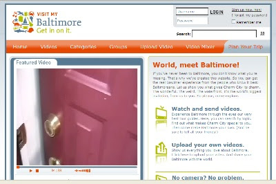
Visit My Baltimore Allows Baltimoreans To Post Video


If you've never been to Baltimore, you don't know what you're missing. That's why we've created this website. So you can get the real Bawlmer experience from the people who know it best: Baltimoreans. Let us show you what gives Charm City its charm. The wonderful. The weird. The waterfront. It's the world's biggest invitation, from us to you. So please, come explore. http://www.visitmybaltimore.com/

Thoughts// The Baltimore Area Convention and Visitors Association launched Visit My Baltimore earlier this summer to allow Baltimoreans the opportunity to show off the best of the city as well as continue the new 'Get in on it' marketing / branding campaign. The site, which uses online video technology from ViTrue, lets users upload their own videos or create a video using a variety of pre-selected clips. So far the site is hosting just under 100 videos. Side note, how can you not love the video rating icon of the crab...a nice touch.

As with several other DMOs who have begun to explore the idea of user-generated video, it would appear that the growth of content is slow, however it is still too early to determine the impact of the site on potential visitors.

In addition to the UGC video site, the BACVA has also launched a mini-site for it's recent 'Get in on it' brand launch. The site, www.areyouinonit.com, offers some good information on how and why the current brand was produced...including a brand-icon match game! If you are currently going through a re-branding process, I would recommend giving it a look. This is not only a good way to introduce a brand to the public, but also to constituents and co-workers who will help determine the success of any new brand.

Wednesday, August 22, 2007

New Orleans CVB Launches 24NOLA.com


With the second anniversary of Hurricane Katrina next week and tourism a vital resource needed for New Orleans' recovery, the New Orleans Convention & Visitors Bureau launched an online component to its "Forever New Orleans" international branding campaign.

24NOLA.com, an itinerary-planning tool for visitors who want to see New Orleans as local residents do. Visitors can scroll through hotels, restaurants and activities for each of the 24 hours of the day and customize their own itinerary. There's also a section where residents and frequent visitors to the city can post their favorite activities. >> 24nola.com

Thoughts// A fresh look and clever take on the itinerary building concept make 24nola.com an interesting and pleasing site to visit. The site's stripped down navigation takes a couple clicks to get use to, but after that it is pretty straight forward...select the time, select an activity, add it to your itinerary and then print. The content and images are informative and expressive of New Orleans and little touches such as the 'Spice Level' rating tie into an overall theme. Unfortunately, the site does not offer users the chance to submit true user-generated content (it appears to be a submit and review system) or receive customized recommendations based upon interests...more than likely a conscious decision. But the simplicity of the site and ease of use make this an interesting case study.

Thursday, July 26, 2007

Case Study: Trail Blazers' Use of Twitter to Chat With NBA Fans

I have been intrigued about the buzz around Twitter and curious about its potential use as a tool to engage and interact with consumers. My curiosity was fueled earlier this summer when I saw a campaign by the Portland Trail Blazers who used Twitter (view the site here) as part of a campaign to stimulate conversation among NBA fans about the recent draft (Portland had the number one pick).

I connected with my friend Stephen Landau, partner at Portland based digital brand agency Substance (his firm created the campaign) for a few words of wisdom…why Twitter, why now and how did it work?

Why did you and the Trail Blazers feel that Twitter was the right platform for this campaign?
When we were thinking about ways for the Trail Blazers to extend their digital brand beyond the web site, the idea of communicating via mobile devices came up. But with traditional text messaging, there's a fairly expensive cost in sending out text messages and setting up a number. Twitter, however, is free to subscribe to (via the web or mobile device), and free to use. This allowed the Trail Blazers to send out messages whenever they wanted.

Why did you we think it was important to communicate using Twitter, why not blogs or email?
With the NBA Draft drawing significant attention because of the caliber of potential first round picks (Greg Oden or Kevin Durant), we wanted to build upon this excitement for the Portland fans. Twitter allowed fans to be a part of the conversation, hearing what was going on pre-draft, all the way up to the moment the draft choice was made.

Post-draft, Twitter was used to send announcements about Greg Oden, his visit to Portland, and then moved into information about Summer League.

We also used Twitter as a content management tool, pulling the Twitter feed directly into the "Oden or Durant" microsite. This allowed the Trail Blazers to publish content to the microsite without investing in a full content management tool.

Can you share any results of the campaign?
Currently, over 150 people are "following" the Trail Blazers Twitter feed via Twitter, which doesn't count other RSS feed subscriptions. The plan is to continue to utilize Twitter for communications during the basketball season... everything from special ticket offers to game results.

Any parting comments?
The interesting part of Twitter, as with many Web 2.0 technologies, isn't what people might initially use it for. For example, many people dismissed Twitter as a "what I'm doing right now" kind of online service, to write about making toast, or going to a movie, or whatever they were doing. But abstracting this idea to further think about, "what is my company (or my brand) doing right now," using the existing technology, allows for continued growth from a digital brand standpoint. The more compelling and relevant the content, the better the conversation between people and brands, and better conversations result in better relationships.