Sorry, We Are Not In Right Now

Hi,

Thanks for checking out our blog, we really appreciate it.

However, our blog has moved to http://travel2dot0.wordpress.com/

Sorry that you have to visit another site to find us, but it is worth it...we have all of our 'classic' posts and comments on the new blog, plus a ton of new thoughts and ideas.

Why are we moving? Basically, Blogger failed us and never responded to our emails and requests. A clear example of poor customer service...too bad, we liked Blogger.

Come over and see us on the new blog.

Regards,
Troy and Mo

Thursday, September 27, 2007

Back-to-school SEO

It's that time of year again when the kids head back to school and the air begins to hint at the coming of fall. I'm sure the first few days of school are spent doing a little refresh to get all the kids back up to speed after the summer months. Of course SEOs don't get summer breaks and the learning doesn't ever really stop or even slow down. But that doesn't mean that a little SEO refresher every now and again isn't useful or is any less valuable.

Here are 10 important elements that should always remain top-of-mind with every SEO. >>Full Story

Thoughts// As an e-marketer, it's easy to get inundated and lost in the plethora of tools currently available at our disposal to tell the brand story. While blogs, RSS, widgets and Twitter may give us additional hooks to tell the story and build relationships with consumers, let's face it, organic search is by far the overwhelming traffic driver to most destination sites. And yet, sadly, SEO (Search Engine Optimization) is often an afterthought in many marketing budget line items.

This 101 on SEO is a timely and much needed refresher course on some basic SEO tactics. Additionally, here are some "must read" articles for SEO:

Finally, if you're looking for proof that SEO matters, look no further than the NY Times. The Times last week figured out that there was more value in opening up its entire archives to the public versus locking them up behind a subscription site. Vivian L. Schiller, senior VP of NYTimes.com stated, "What wasn’t anticipated was the explosion in how much of our traffic would be generated by Google, by Yahoo and some others."

Wednesday, September 26, 2007

Unknown Canada Goes Viral


With little to no branding involved, Tribal DDB Toronto's ploy for the Canadian Tourism Commission began last August and sent an unassuming couple on a jaunt across three major Canadian cities--namely Toronto, Ottawa and Montreal.

Posing as tourists, the pair were told to indulge themselves throughout with the only stipulation being to capture their fun on a digital camera and a camcorder. The footage was then sent to be inserted into 1,000 USB keys, which were also stuffed with MP3's of hip Canadian acts along with the couple's itinerary. They would then be "mistakenly" left in key American markets, including Chicago as one of the central locations.

Those who found the keys and loaded them up would find an embedded link once they played the MP3's, which directed them ultimately to the landing page "Unknown Canada." Nevertheless, the clever strategy leads the key owners to a site that includes a host of information and destinations for not just the three cities mentioned, but also Vancouver and Calgary. Additionally, descriptions of Canadian indie acts like Stars and Malajube can be perused, adding up quite an experiential taste of our neighbors up North.

Thoughts// A quirky little site from our friends to north, Unknown Canada, shows 'adventurous' travelers some of the little known sites and sounds of Canada. The real star of the show is the way this campaign was introduced to the public via USB keys or flash drives...similar to the promotion of the most recent Nine Inch Nails album, Year Zero. A clever way to get consumers actively involved with your brand...as long as you deliver a payoff worthy of the effort involved.

Adding some additional content, such as a few unique videos and mapping features to the site, would be a way to further engage the consumer.

Tuesday, September 25, 2007

Social Sites Becoming Too Much Of A Good Thing

Aarica Caro is sick of sharing. That is, sharing online.

She has shared the lives of her cats. She has shared a list of her favorite television shows and movies ("Grey's Anatomy," chick flicks). She has shared her reviews of Bay Area haunts (two stars for the Old Spaghetti Factory in San Jose, five stars for the Starbucks in Morgan Hill). And she has been invited to share some more.

If you believe the buzz, the latest incarnation of the Web is all about sharing, connecting and community. Social networking sites such as MySpace and Palo Alto's Facebook have exploded in popularity, drawing new users into the fold each day. >>Full Story

Thoughts// A good article from the San Francisco Chronicle which raises the question of a social networking burnout. While the users featured in the article are certainly not representative of all social networking users, they do suggest that the wealth of social sites available to consumers is becoming a bit overwhelming.

Some of the attrition at these sites can simply be explained by users signing up to learn more about the service and then deciding the do not want to participate or just fading away. Of course, in the case of MySpace and Facebook, daily sign-ups are far out pacing this number.

However, the question is out there...with so many sites, major investors (who want major profits), scams and a host of other factors...how many social networking sites are too many? How long until the market is saturated? How long until there is consolidation (at least via profile) of these sites? Are the current group of social networking sites strong enough to remain relevant in 5 years?

Personally, I think we can start by consolidating catster and dogster into 'petster' (Don't bother looking up the domain name, I have already locked it up).

Travel Trends - JetBlue, Wayback Machine, Online Video Ads


The Wayback Machine - An established (possibly old) site for some people, however the Internet Archives' Wayback Machine still proves to be a great resource...especially for those who missed the initial launch and have not heard of it (I forget that not everyone knows about this site). The concept is pretty simple, type in a domain name and browse through the previous versions of the site...for example, Travelocity.com a la 1996 (pictured...and yes, it really did look like that). A great way to understand the evolution of web site design.
http://www.archive.org/

JetBlue Point of View Photo Contest - As mentioned in a previous post, JetBlue has been holding a photo contest to promote the collaboration of the airline and Google. To host the images from the contest, JetBlue is using Google's Picasa photo sharing service (naturally). Although it appears that the entire contest was not completed via Picasa, the use of a photo sharing site (Picasa or Flickr) to promote and run a photo contest is an interesting approach...if the consumers are already using Flickr or Picasa, take the photo contest to them, rather than making them come to you (your site). Take a look at the finalists and vote for your favorite.
http://jetblue.com/google/

Online Video Advertising - A recent TNS study in partnership with AOL and Google presents some key findings for online video advertising. While these results are specifically speaking about advertising on other online videos (such as advertising before a YouTube video), they do provide good insight into some general online video factors.
http://adage.com/

How Not To Run An In-Store Kiosk


For those of you new to this issue, Best Buy was caught using a duplicate website to fool customers who tried to compare internet prices with in-store prices.

Customers who asked why the price was higher in the store were often told that "the sale must have ended" in the time it took them to drive to the store. They were then told to "check the website" to see for themselves, then were shown an identical-looking website that displayed different "in-store" prices. >>Full Story

Thoughts// A bit of a dated story, but still relevant, especially with this great post from the Consumerist.com (if you did not read the whole story, you should). I would assume that most normal people would read this story and react with a standard 'what were they thinking?' question. After all this is a major corporation, whose employees (at least some of them) thought, at some point in time, that this scheme was a good idea. It certainly proves that even the largest companies do not always think about the long-term effects of a business decision...let alone how the customers will actually react.

So how does this apply to the interactive / travel side of things...simple, tell your consumers the truth. Be open and honest with them. If they want to unsubscribe from your email list, then let them. If the don't want a brochure about fishing in your state, town, county, then don't trick them into ordering one. Focus on the consumers who do show an interest in your location, they are already interested and they want to know more. Sounds simple enough, doesn't it?

CBS Gets Promiscuous


"Swingtown" is a CBS television show, scheduled for midseason, about partner-swapping couples. It's also what CBS executives lightheartedly call their new Internet strategy. The idea is to let their online material be promiscuous: Instead of limiting their shows and other online video to CBS.com, the network is letting them couple with any website that people might visit. >>Full Story (requires registration - sorry!)

Thoughts// A really interesting case study in the LA Times this week about the evolving and gutsy interactive strategy of CBS. Instead of following the trends and trying to dump all of its offerings into the flagship CBS.com site, the network has taken to the open road and is looking for "open, nonexclusive, multiple partnerships." So what it essentially means is that consumers can check out their favorite CSI shows and 60 minutes or Letterman clips in the spaces that they're already hanging out at --- YouTube, MySpace, Facebook etc.

This new metamorphosis in online strategy is also reflected in a new and revamped website which is a stark departure from the current "TV guidesque" look of other networks. Incorporating Web 2.0 elements such as social networking that allows fans of a show to congregate together, widgets that allow fans to post video and other elements on blogs/My Space etc and tag cloud navigation, the new site makes a concerted effort to build community and create enthusiasts for the networks' shows.


Thursday, September 20, 2007

Avoiding 'the Slog' with Horizon Air


Some people call it the "road of regret" or the "heartache highway," but I-5 covering the Seattle-Portland trail has its share of disgruntled road warriors according to Horizon Air. Therefore, with the help of agency Wongdoody, the airline is aiming to placate Northwestern business travelers with not just a $99 shuttle offer, but a website capturing video that canvasses infamous landmarks along the dreaded trail.

Locales with names such as Filthy John's Holler, Molasses Pass, Longblink Gulch and the Bridge of Heavy Sighs comprise the three-hour sojourn, with grey-black, well-edited footage, morose music and amusing narration giving site visitors a vivid feel of each destination on the pathway--conclusively making air travel seem that much more convenient.
http://www.i-5slog.com/

Thoughts// A clever creative execution from Horizon Air to promote there 'Horizon Route' for travelers from Portland to Seattle. Speaking from a purely creative / aesthetic perspective, the I-5 slog website (micro-site) is easy-to-read and navigate, well composed and incorporates a good use of online video. The rustic feel of the site is not only a nod to the expeditions that discovered this section of the country, but a reason to keep clicking around the site. It would be interesting to know how this piece was integrated into the overall campaign...via email, online banners or other placements.

So, Mo, is the I-5 really that bad? And do you call it 'the Slog'?

Travel Trends - TripIt, Click Here


Tripit - Travel planning service Tripit has entered into beta testing, allowing consumers to try out the new service. Tripit does not actually allow you to book travel, rather it organizes all of your itineraries, schedules and travel plans into one, easy-to-read page...all you have to do is email you confirmation emails to Tripit and allow it to create the page. As one report said, this is the first hint of a semantic web (I will explain what that means another time).
http://www.tripit.com/

Click Here - or don't. A very interesting study from Marketing Sherpa on which type of 'click here' text actually makes people click. Using a quick A/B test, they came up with these results:

...As in many tests, not all of the answers to our questions were clear cut, but the most important ones were. For example, we discovered that the incumbent, "Continue here ...," wasn't doing our clickthrough rates any favors (well, so much for going with your gut).

Here were the differences in clickthroughs:
"Click to continue": 8.53%
"Continue to article": 3.3%
"Read more": (-)1.8%

With these results, we had a strong feeling that the front-runner, "Click to continue," would win in the A/B test, and it did -- producing 3.5% more clicks than "Continue to article." Needless to say, we immediately switched the words in our link in all of our newsletters...

An excellent reason to test the effectiveness and content of your interactive marketing campaigns...even the smallest words can make a big difference.
http://www.marketingsherpa.com/

Tuesday, September 18, 2007

MySpace Launches Targeted Ad Program


News Corp.'s MySpace social networking site is using personal details contained on users' profile pages and blogs to sell highly targeted advertising, the company said Tuesday.

The Web site started the first phase of its "interest targeting" experiment in July, culling likes and dislikes from its users' pages to sell ads in 10 broad categories such as finance, autos, fashion and music. >>Full Story

Thoughts// The announcement that MySpace will begin behaviorally targeting users based upon their MySpace pages could become the first real test to determine the threshold of how much information consumers are willing to give in order to receive targeted, relevant ads. While most online users have been behaviorally targeted already, one would assume the vast majority of this group is unaware that any targeting has taken place. However, in the case of MySpace there is the potential for a connected, vocal group to educate the majority of users on how their profiles are being searched for keywords...and for those users upset with the practice to move on to another social networking site.

While most behavioral targeting takes into account which pages you have previously visited and then serves ads for those companies (basically), the MySpace model will actively search out and look for keywords that you have used in blogs, quotes and descriptions of yourself on your MySpace page. So, if you have just wrote a blog about your upcoming vacation to China, a company such as Orbitz (for example) could use that information to run targeted, China-related banners (for flights, hotels, etc.) on your MySpace page. Talk about a targeted message.

As the investors and parent companies of these popular web companies look to monetize and recoup investments, how will advertising programs such as this one affect the reputation of these sites with there members? Will MySpace users accept this type of advertising or simply move on to the next, new site?

Sunday, September 16, 2007

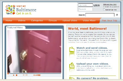
Visit My Baltimore Allows Baltimoreans To Post Video


If you've never been to Baltimore, you don't know what you're missing. That's why we've created this website. So you can get the real Bawlmer experience from the people who know it best: Baltimoreans. Let us show you what gives Charm City its charm. The wonderful. The weird. The waterfront. It's the world's biggest invitation, from us to you. So please, come explore. http://www.visitmybaltimore.com/

Thoughts// The Baltimore Area Convention and Visitors Association launched Visit My Baltimore earlier this summer to allow Baltimoreans the opportunity to show off the best of the city as well as continue the new 'Get in on it' marketing / branding campaign. The site, which uses online video technology from ViTrue, lets users upload their own videos or create a video using a variety of pre-selected clips. So far the site is hosting just under 100 videos. Side note, how can you not love the video rating icon of the crab...a nice touch.

As with several other DMOs who have begun to explore the idea of user-generated video, it would appear that the growth of content is slow, however it is still too early to determine the impact of the site on potential visitors.

In addition to the UGC video site, the BACVA has also launched a mini-site for it's recent 'Get in on it' brand launch. The site, www.areyouinonit.com, offers some good information on how and why the current brand was produced...including a brand-icon match game! If you are currently going through a re-branding process, I would recommend giving it a look. This is not only a good way to introduce a brand to the public, but also to constituents and co-workers who will help determine the success of any new brand.

Travel Trends - Yahoo! MapMixer, PayPal


Yahoo! MapMixer - An interesting addition to the Yahoo! Local / Map offering, MapMixer allows users to combine existing maps with the Yahoo! Maps program. In the example above, a user has taken a detailed map of Grand Canyon National Park and created a new map containing both maps. The site lets users zoom, pan and explore the map in the same fashion as the normal Yahoo! Maps site. Microsoft Research has a similar product called MSR MapCruncher.
http://maps.yahoo.com/mapmixer

PayPal Your Airline Tickets - Following the lead from Northwest Airlines, several carriers including Southwest, Midwest and US Airways now accept payment via the online e-commerce firm PayPal. JetBlue began allowing customers to pay via Bill Me Later, a similar product earlier this year.

Saturday, September 15, 2007

New Social Sites Cater to People of a Certain Age


Older people are sticky. That is the latest view from Silicon Valley. Technology investors and entrepreneurs, long obsessed with connecting to teenagers and 20-somethings, are starting a host of new social networking sites aimed at baby boomers and graying computer users.

The sites have names like Eons, Rezoom, Multiply, Maya’s Mom, Boomj, and Boomertown. They look like Facebook — with wrinkles. And they are seeking to capitalize on what investors say may be a profitable characteristic of older Internet users: they are less liankely than youngsters to flit from one trendy site to the next. >>Full Story

Thoughts// Yet more evidence that the connectivity afforded by the digital age isn't just restricted to Gen X or the millennials. This NYT piece highlights emeging new social networks catering to boomers and older adults, who are increasingly congregating in smaller niche networks of the like-minded folks discussing a host of lifestyle issues. Most importantly, boomers were likely to be loyal to a network and are "stickier," with one network citing that 96% of users returning each month (Consider however that half of all Facebook's 30 million+ users login daily).

Perhaps the following quotes offer some insight into how such niche networks are different than Facebook and MySpace.

  • “I feel like I’m putting down roots, building relationships...my feeling on MySpace is that people give you a poke, and then they’re gone and you never see them again.” (38 year old CO mom)
  • “I’ve discussed my divorce, my medical issues, and when do I dare go dating again...I sure wouldn’t discuss that stuff with a 20-year-old.” (Martha Starks, 52, a retired optician in Tucson, who spends an hour or two each evening on a site called Eons.)

Tuesday, September 11, 2007

Word of the Week - Folksonomy

A means of classifying and categorizing data on the web through collaborative efforts from the online community. Commonly known as (though not strictly synonymous to) ‘tagging’.

The basic idea behind a Folksonomy is rather than save files in a typical folder structure, you simply apply a tag to that file ('Budget' for instance). And then, when you need to find the file, you search for 'budget'. No need to click-thru that giant list of folders. Or, at least that is the basic idea.

Unfortunately, folksonomies won't improve your organizational skills.

Travel Trends - Flickrvision, Millennials


Flickrvision - A mashup in the truest since of the word, Flickrvision lets you watch in real-time as users upload images to Flickr, all set against a Google Map. An interesting look into what other people around the world are uploading to Flickr. As it turns out, most of the world appears to have pretty similar interests when it comes to photos.
http://flickrvision.com/

Millennials - A good report from Deloitte's study on Media & Entertainment, courtesy of the Center for Media Research. Findings include:

  • 51% of all consumers are watching/reading personal content created by others; the number jumps to 71% for Millennials
  • 55% of Millennials and 42% of Xers read blogs
  • 62% of Millennials and 41% of Xers watch YouTube or other video streaming sites
  • 40% of all consumers are creating their own entertainment, such as editing movies, music and photos.
  • 56% Millennials are creating their own entertainment
  • 25% of Matures report creating their own entertainment
http://www.centerformediaresearch.com/

Thursday, September 6, 2007

Orbitz Debuts Traveler Update Feature


OrbitzTLC Traveler Update combines up-to-the-minute information from the Federal Aviation Administration (FAA), OrbitzTLC air traffic alerts and data from the Transportation Security Administration (TSA) with the contributions and reports of everyday travelers to create a powerful new information resource. Content includes real-time data and information on security line wait times, traffic delays, parking updates, taxi lines, flight delays, weather information and more. >>Full Story

Thoughts// A new offering from Orbitz, the 'OrbitzTLC Traveler Update' allows users to post messages and alerts for other Orbitz flyers. What is intriguing about this offering is how Orbitz has centralized a good deal of airport related information on one page...for example, the Phoenix Sky Harbor International page contains traffic updates (from Google), weather (from weather.com, more than likely), parking advice (from PHX), average security line wait times (again, from PHX) and tips from other travelers.

Additionally, it would appear that the bulk of the tips are coming from either repeat travelers or users who work at or for the airport. Interesting that someone at the airport (might have) realized what a great option this could be for communicating with consumers. If only they would have thought of it first.

Wednesday, September 5, 2007

The United Countries of Baseball

(click the map for a larger version)

In a retail branding effort that bonds Nike and the MLB, this poster campaign from Cole & Weber United is based on extensive data collection, according to the agency, which, among other things, charts fan loyalty, depicting the geographic boundaries of each team's fan base. In a tie-in with a Nike baseball clothing line, there are 30 team maps as well a series of ads and posters featuring individual players. The posters are seen in baseball team shops and Niketown stores.

Thoughts// Not exactly interactive-related, but I cannot help but love the execution of this Nike Baseball campaign. As the article says, the agency used data collection to create an accurate picture of the baseball fan divide in the US. The combination of a popular subject (baseball) in an easy-to-use and enjoyable format (a map) puts a creative spin on well-known information. From a travel perspective, how could we take this concept, apply typical (dare I say boring) information to a map and create a new way of looking at the data.

And I really think the Braves piece of the map should go a little deeper into Florida...but that is just my opinion.

Travel Trends - Dopplr, YouSendIt, WAA


Dopplr - "Dopplr is an online service for frequent travellers. It lets you share your future travel plans with a group of trusted fellow travellers that you have chosen." Dopplr, a relatively new site that is still in private beta, allows you to add upcoming trips to your profile and automatically update any friends and family of your travel whereabouts. You could describe the social-networking / travel planning site as a travel version of Twitter. Let your friends know where you are going and find out if any of them will be there at the same time. (Editor's note: Dopplr is based out of the U.K., hence the 'English' English spelling of travellers in the company description)
http://www.dopplr.com/

YouSendIt - Yesterday a co-worker was having trouble receiving a large file from an outside vendor. Typical issue, the file was too large to email into our network, mailing a CD would take too long and there was not an easy-to-use FTP site available. Enter YouSendIt, a simple site that allows users to upload large files and then automatically email the link to the file. While I would not recommend sending confidential documents via YouSendIt, the system works great for those large PowerPoint or Excel files that we all have. Several other companies offer similar services, but YouSendIt is free (for basic service) and easy.
http://www.yousendit.com/

WAA - The Web Analytics Association (WAA) announced a big step towards industry standardization with the acceptance of 26 standard definitions for web analytic metrics. The 26 terms focused on the areas of unique visitors, visits/sessions and page views. It is about time...
http://www.webanalyticsassociation.org/

Tuesday, September 4, 2007

Bugaboo Daytrips

Travel sites have thrived by helping users customize trips, providing travel-related content to enhance the booking experience, and up-selling purchases with car rental and hotel reservations from their partners. Restaurant review sites make it easy to select the right place to grab a bite. A microsite from trendy Dutch stroller company Bugaboo does just that. At Bugaboo Daytrips, users can browse a world map to select a day trip relating to one of over a dozen different cities. >>Full Story

Thoughts// A really interesting example of 1) how to build and display trip ideas with style; 2) How to subtly market your product while giving consumers a valuable service.

The presentation and user interface are sublime; I was totally awed by the minimalist but engaging design and kept digging around to learn about each destination and recommended day trips. When you get to the destination of your choice, you'll note that each of the maps were produced by local artists (Portland map pictured above) and careful attention was paid to convey a sense of place. On the downside however, the site is resource heavy and load times aren't optimal. In addition, none of the PDF maps I downloaded (Portland, LA, Miami) appears to work.